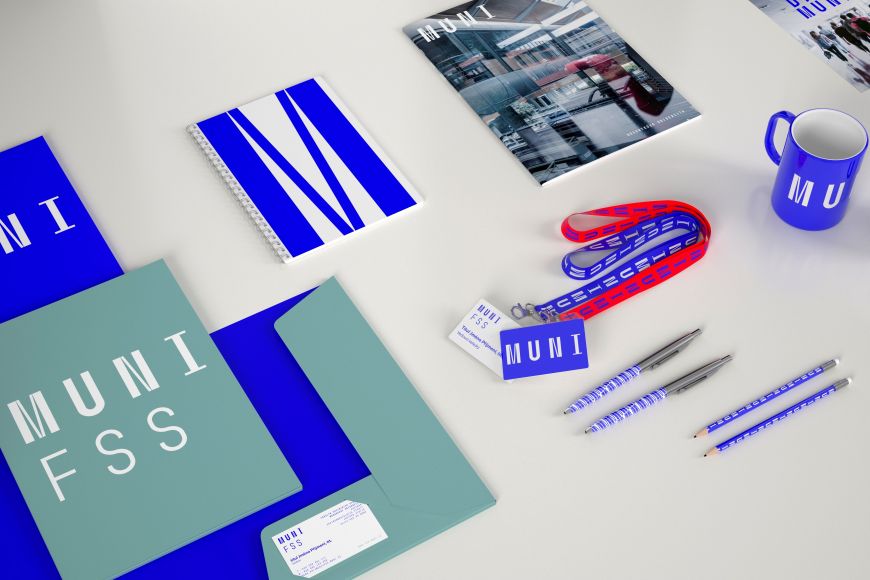
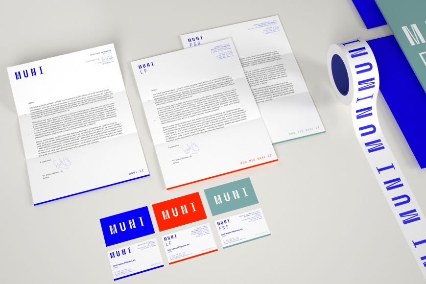
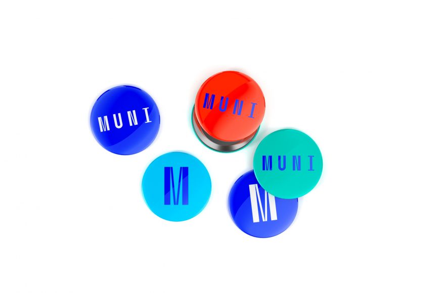
Masaryk University will be implementing its new logo and the related visual identity over the course of the next year. It is a gift from the university to itself on the occasion of its upcoming 100th anniversary on 28 January 2019. Studio Najbrt from Prague won the tender for the new style and logo with a design that evokes the functionalist tradition of Brno. The visual identity is built around a brand new font, which has also been used to design the new Muni logo.
The university is changing its public face after many years: the previous logo featuring the letters “M” and “U” surrounded by the university’s name in Latin – Universitas Masarykiana Brunensis – has been used since 1990.
As Masaryk University Rector Mikuláš Bek explains, “The current logo was created in a hurry and is a product of its era, where many universities had seal-shaped brands, even though there was often no historical basis for them. For our centenary celebrations, we need a logo that will represent the modern spirit and nature of our university, the emphasis we place on functionality and efficiency, and also our confidence and courage to look for new solutions.”
Video introducing new visual identity (in Czech only)
Studio Najbrt, the winner of the tender, had to defeat its competition over two rounds. First, the university issued a call for tender to leading design studios and promising young designers, and a panel then chose two of these to provide more detailed proposals. The tender participants were asked to create a basic logotype, a graphic design of the Masaryk University name, and also colours, font, and the overall interconnected system of individual design elements.
The panel, which included design experts, employees, and university students, decided to award the tender to Studio Najbrt, whose design was particularly praised for the overall idea and a coherent system of applications.
The concept of the new visual identity is based on the Muni font and logotype. According to Aleš Najbrt, “It draws on functionalism, the interwar period, and the ideals that we associate with that time because we feel that they overlap with Masaryk University values. The visual identity is therefore simple and functional.” The same holds true for the new monospaced font, where every letter occupies the same amount of space and evokes the academic values of equal opportunities and democracy.
The university will start to implement individual elements of the new visual identity from March 2018. The first diplomas with the new logo will be issued to students graduating in October.
Possible usage of new visual identity