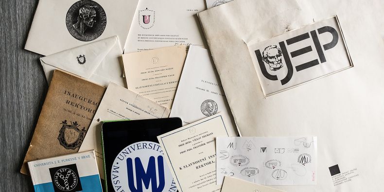
The blue logo featuring the letters “M” and “U” surrounded by the university’s name in Latin – Universitas Masarykiana Brunensis – has been used since the spring of 1990. The design by the graphic designer, painter, and artist Ivan Štrouf was approved with the understanding that it would be sometimes difficult to use and that it was less than perfect in some respects, but it was sufficient for what was needed at that time. However, the university expanded and grew to become much bigger in the nearly three decades since.
With the expansion came a rise in various forms of visual presentation. At the moment, there are a lot of them – so many, in fact, that it is often unclear that the individual parts of the university actually belong together. These are the results of a recent analysis commissioned by the university. A planned uniform visual style, which is currently in the making, is designed to rectify these issues.
“While we use the Masaryk University logo for outward presentation, some related logos are not recognizable as being associated with the university. The new uniform visual style should form a functional and logical visual system,” explains Hana Svatoňová, vice-rector for external relations. “This will allow every part of the university to stay unique while taking advantage of the strong MU brand.” This vision will become part of the forthcoming competition to select the creator of the new style.
The work on a new uniform visual style for MU started in 2015 by updating the style while keeping the existing logos.
Masaryk University is not the only institution to do this: the universities in Ostrava, Pardubice, and České Budějovice as well as the Brno University of Technology have all recently commissioned new logos. With this type and size of institution, the whole process usually takes several years and is very complicated.
“To unify the university materials, we started using a logo featuring only the letters M and U without the circular inscription, because that’s the part which is sometimes difficult to use. The basic colour of the logo is blue, but it also exists in the colours of the individual faculties. It is already used on all printed materials, forms, promotional products, and web presentations,” explains Pavla Hudcová from the Public Relations and Marketing Office, which is part of the Rector’s Office.
In her words, the goal is now not only to find a new common logotype, but to create a functional system that will be easy to use on various occasions.
The system should be organized in such a way that the “daughter institution” will inherit the symbols used by its “parent institution”. This will be useful when promoting the individual faculties, departments, and projects. Especially with the two latter categories, it is currently often difficult to recognize their relationship to the university as a whole.
After a number of studies and internal discussions within the university, the practical part of the whole process of creating a new common logo and a uniform visual style is now underway.
A preparatory committee of experts who have experience with similar competitions got down to work in March. Soon, reputable graphic studios as well as promising young designers will be asked to join in the call for tenders. The design competition will have two rounds and it will not be open to everyone.
There is a reason for that. As Hudcová explains: “We want the best people in the field to work for us, so we first meet with them and talk to them about our vision and, most importantly, we tell them what the university wants to communicate with its new visual identity and how it wants to be perceived.”
The authors of the winning tender, which will be selected by a committee of experts and university representatives, will create a complete visual style.
Hudcová thinks that the combination of renowned studios and talented beginning artists is very favourable for achieving a good result. “An institution that has thirty-four thousand students and almost five thousand employees has the potential to become a leader in graphic design as well. It can afford to have a bold logo that also allows space for individuality.”
It is expected that the winner of the competition will be announced in the summer. During the autumn, the university should receive a complete manual with one main logo, a new font, and suggestions for use in various materials, different types of advertising space, buildings, and systems. The work on a uniform web presentation will start right after the selection of the winner.
In 2018, the application of the logo will be developed in more detail, so that the logo can be revealed in October 2018 during the celebrations of the 100th anniversary of the creation of Czechoslovakia, together with the planned schedule of celebrations of the 100th anniversary of the foundation of the Masaryk University.
